Flat design does not mean it is acceptable to leave out key aspects of good design. I am encountering many designs that are trying to minimize the number of visuals on the screen in an attempt to make a flat design. In the process the design are missing all of the affordances the user interface needs in order to let the user know what they can click on. Just leaving the screen to hover overs with text and cursor changes alters the user experience from a process of getting the task done to figuring out what can be done.
Why are we making people guess? When we go to your website , unless it is a puzzle site, we are not interested in figuring out your mental model of the world. Make it explicit. Make all clickable items have the same visual indicator, say, the color or a line. I am sure you can come up with something.
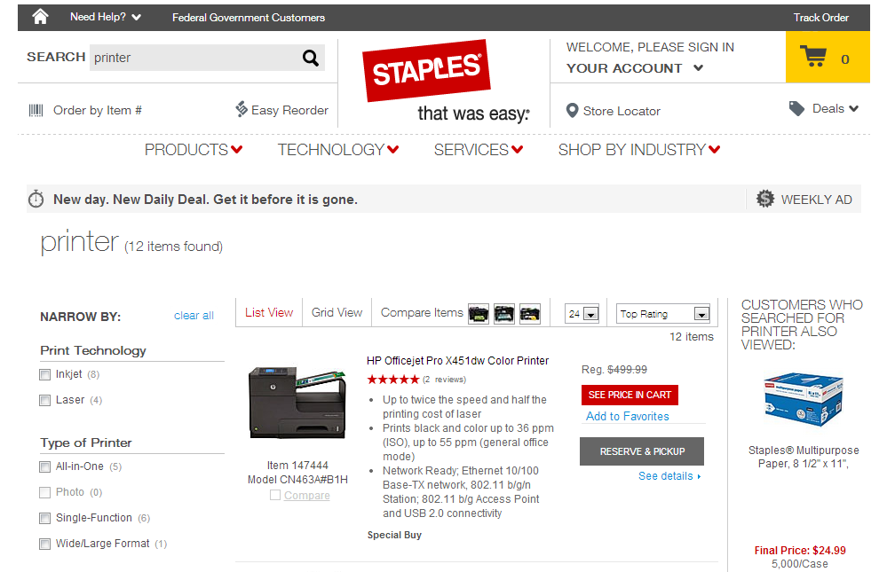
Here is the latest example I encountered shopping for a new printer. I just clicked the checkboxes to compare 3 printers then scrolled up and down the page 3 times to find the compare button. I was beginning to think that it would happen auto-magically and perhaps my connection was slow.

So take a good look at this image. What is clickable? The red and light blue things right? Yes of course and most of the greyed out text is also clickable. You should have known. Now scroll up and down the page quickly to find what you want. Where is the Compare button?
Why create a visual language that makes people guess? Make the affordances explicit so people know what to click on.
