
When you can see the whole path it is easy to know where you are. If you take a hike in the woods, the trail map lets you know where you are going and where you have come from.

When working on your computer or phone, it is impossible to see the whole application from one screen. Have you ever been online or in an application and felt confused- or lost- about where you are and where you want to go? You probably searched the screen for clues to help understand where you are in the scheme of things. One navigation technique that illustrates where you are and where you came from is a breadcrumb. Breadcrumb? Think Hansel and Gretel.
Defining Breadcrumbs
A breadcrumb is a device that illustrates each of the pages you have encountered before you have arrived at your current page or screen.
One way to think about this are using the pages in a book. Cover, copyright, table of contents, and chapter 1 are the first four things you encounter in the book. If you go in order and land on Chapter, 1 the breadcrumb will look like this:
Cover/ Copyright / Table of Contents / Chapter 1
Since the breadcrumb is made to help you while interacting with the computer, it can also be used to enhance navigation. To allow you to easily move back through the pages, you can navigate by using hyperlinks on the breadcrumb.
Cover/ Copyright / Table of Contents / Chapter 1
By clicking on the hyperlink Copyright, you will go directly to the Copyright page. This is very helpful when the breadcrumb is short. When the breadcrumb gets too long it becomes more difficult to use.
Can breadcrumbs go too far?
What if you have a large application with 100’s of pages? In our example above, if you are on page 10 of Chapter 1 your breadcrumb would look like this:
Cover/ Copyright / Table of Contents / Chapter 1 Pg1 / Chapter 1 Pg2 / Chapter 1 Pg3 / Chapter 1 Pg4 / Chapter 1 Pg5 / Chapter 1 Pg6 / Chapter 1 Pg7 / Chapter 1 Pg8 / Chapter 1 Pg9 / Chapter 1 Pg10
If the breadcrumb continued to indicate every page that you had clicked on, the breadcrumb would keep wrapping and become unusable.
The use of breadcrumbs in this manner starts to raise some questions.
- Is it going to scale?
- What problem are you trying to solve?
- Is it needed?
- Is it useful?
- Can a person even process a long breadcrumb effectively? Or does a long breadcrumb make things more confusing?
Here is a possible solution for the book example above. At a minimum, knowing where I came from is really only one page back:
Chapter 1 Pg9 / Chapter 1 Pg10
If you go to Chapter 1 Pg9, you will be able to see where you came from in its breadcrumb (ie. Chapter 1 Pg10). This may not be sufficient to give you a good sense of where you are. In our book example, the Table of Contents acts much like a homepage with access to all parts of the book.
Perhaps the Table of Contents is a relevant starting point to provide.
Table of Contents / Chapter 1 Pg9 / Chapter 1 Pg10
This representation of the breadcrumb will scale and provide the person with just enough information about where they came from and where they are.
I have encountered unique ways of combining controls to try to simplify the interaction and visuals on the page. Sometimes these ideas are great and I look to incorporate the ideas into my designs. In other cases, I find flaws that make me concerned that the simple control is being overloaded. In the next section, I will review the latter.
Enhancing the Breadcrumb
Earlier, I noted that it is important to provide users with information about where they are, where they are going and where they came from. Breadcrumbs only cover 2 of the 3:
- To identify where you are
- To identify where you came from
The third piece, showing where you can go, is not part of a standard breadcrumb.
I am going to share a design where a designer was trying to add the ability to navigate to other places into the breadcrumbs. Let’s take a look at the example which is a simple hierarchy.

Let me explain the design
So if you were on the detail page 1a the breadcrumb would look like:
If you are a novice, this works well because the navigation teaches you the structure of the application. If you are an expert and want to jump to another section, how do you do this with a breadcrumb?
Here is the problem this design is trying to resolve. At this point, how do you know where to go without going back to each page you came from and then clicking through to the next page? Using the simple breadcrumb for navigation requires a lot of clicks and waiting. So the design can incorporate navigation to the other pages to reduce the number of clicks and wait time.
This design handled the navigation with dropdowns. The dropdowns contained the values at the Section and Detail levels in the diagram. With this example breadcrumb,
Summary / Section1 /1a, where would you put the dropdown for selecting sections? For selecting details?
The example design does the following:
- Start at the Summary page, open the dropdown and Select Section 1
- The breadcrumb on the next page grows to show Summary and Section 1 with dropdowns
- Open Section 1 dropdown and Select 1a
- The breadcrumb on the next page grows to show Summary and Section 1 with dropdowns and an additional piece of the breadcrumb 1a that does not have a dropdown

I found this placement of dropdowns confusing and inconsistent. When I go to the Section 1 dropdown I expect to see the other sections, Section 2 & Section 3. This design moves you up one level to find another item at the same level you are at. So if you are on the detail page 1a you have to go to the Section 1 dropdown to find 1b & 1c.
This design removes the need for a navigation bar or menu, it is all in the breadcrumb. With this design, you can get to the different pages without navigating back up. However, the design adds complexity to the standard breadcrumbs in an attempt to simplify the overall navigation in a page.
This design confuses the navigation and the context with the use of the dropdown. Perhaps there is a more consistent way to approach this. Let’s explore another design possibility to solve the same problem with the same breadcrumb control.
Better Design Choices for Navigating with a Breadcrumb
Keeping Consistent Expectations
Dropdown lists contains like items. Typically the items are a mutually exclusive set. Therefore, if I was looking at the Section 1 dropdown I would expect to see the list of sections (not the details list).
So what would I do to solve this problem of providing a user a quick way to navigate to application using breadcrumbs? (Note: I am putting aside the question of whether breadcrumbs are appropriate for general navigation.)
Let’s Walk Through
Given our hierarchy the breadcrumb should be like this, using dropdowns as navigation:

- Summary does not have siblings therefore does not have a dropdown
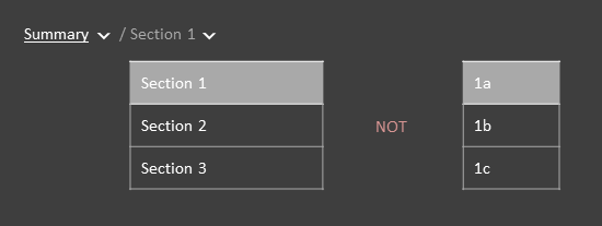
- Section 1 has has two siblings, Section 2 & Section 3 so its dropdown looks like this:

- 1a has two siblings 1b, 1c and the dropdown could look like this:

- In this case, 1a sits in a symmetrical hierarchy and therefore has 5 cousins that are mutually exclusive at that level: 2a, 2b, 3a, 3b, and 3c, so its dropdown could look like this:

Moving the dropdown in context with the breadcrumb pieces only covers part of the critiqued design. In addition to this navigation, the critiqued design had the ability to get to pages the next level down using the dropdown (e.g. when you were on the Section1 page the breadcrumb dropdown for Section 1 showed the selections of the pages one level down: 1a, 1b, and 1c).
Review the Revised Breadcrumb
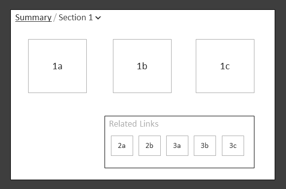
For this revised design, let’s review a sketch of the page and breadcrumb. If you are on the Summary page the breadcrumb is only the title “Summary” since it is at the top of the hierarchy.

The breadcrumb cannot be used to navigate down because the next level is not in the breadcrumb. The navigation will have to be done in the page (e.g. Section 1, Section 2, and Section 3).
Likewise, when in the section, such as Section 1, the page and breadcrumb are displayed like this:

Summary is a link back to the Summary page. Section 1 has a dropdown with the values Section 2 and Section 3. The navigation to the next level pages are done in the page (e.g. 1a, 1b, and 1c).
Keeping the navigation separate between the breadcrumbs and the content in the page may be sufficient for you. If this is good enough we can stop here. However, I want to attempt to cover the same abilities that are in the design I am critiquing. I need to show how to navigate to the next level using the breadcrumb.
Navigating to the Next Level (a mess)
In this section, I will try one possible approach to navigating to the next page using the breadcrumb. One possible approach would be to take from the best practices of forms. If you require a selection but do not have a default value use placeholder text such as <select>. So if you are on the summary page you would see:
The <select> dropdown contains the values Section 1, Section 2 and Section 3.
Or if you are on the section page you would see:
The <select> dropdown contains the values 1a, 1b, and 1c.
This could work but it introduces new issues:
- It makes the breadcrumbs unnecessarily messy
- It is visually noisy for something that can be done on the page in another manner
- It is not clear what page you are on
It is interesting to explore other options, however I do not think this design will work well for people using the system. Let’s scrap this idea and move on to something better.
Let’s Keep it Simple
My preference for navigating to the next level would be to remain in the page and add a related links section. Let’s avoid adding the next level of navigation to the breadcrumbs.
To Sum it All Up
Breadcrumbs are a really simple and effective way to identify where you are and where you come from. Adding extra navigation in a breadcrumb overloads the control and makes it complex. With some judicious choices and testing you may be able to make a breadcrumb with good navigation. We will see. I look forward to testing this and reporting back.
In the meantime, do you know of other extensions to the breadcrumb that have worked well?